Modernizing Your Brand Can Yield To Major Sales And Awareness Changes
Sometimes a brand just needs a few tweaks to make it become a pop culture sensation. And those tweaks may involve the overall brand identity. One such brand that experienced a complete turnaround by getting a full makeover was the Anime Expo, a meteoric, four day event celebrating Japanese pop culture and entertainment. Not only is it an anime centric cesspool hosting hundreds of thousands of fans, but it just might be the holy city for would be anime cultists. The dedication is real.
With the majority of these fans setting aside months of planning and networking for this event alone, the result is the amoebic construction of a global community obsessed with one ideal. But before the brand makeover, there was a disconnect and the powerful potential of the expo was languishing. In this blog, Hollywood Branded shares how one branding company completely rebranded and evolved the brand identity of an event to make Anime Expo become the top anime convention in the world.
.png?width=619&name=Case%20Study%20(1).png)
The Otaku Whisperer
Blind is a brand strategy design consultancy. They help brands & businesses "gain a competitive advantage in a connected world" or at least, that is what they say they do on their website. They were hired for a mission to rebrand Anime Expo from the core to increase recognition and open streams of revenue.
Anime Expo is officially organized by the non-profit organization SPJA, or The Society for the Promotion of Japanese Animation. Their CEO, Mark Manansala, and his team met with Blind’s Chief Strategist, Chris Do for a two day brand strategy jam session. During this time, Chris discussed the main challenge hindering the AX brand: they needed to fully prioritize the needs and goals of both the business and its consumers.
When it comes to anime and the culture surrounding it, community matters. So creating the perfect haven to house these obsessed otaku (intense anime fan) was the main priority for Anime Expo. Blind had to understand the AX brand, who they were championing, and why their statement mattered. Once crafting this, Blind would be able to set the tone for the event. If the mood of a brand is understood outright, crafting services around that identity becomes much easier.
Know Your Type
The First Anime Expo took place on July 3, 1992. Humble beginnings to say the least. They’ve managed to experiment with a few different logo designs since then, so Blind took it upon themselves to find one that truly spoke to this generation’s anime consumers.


The first official Anime Expo - July 3rd, 1992
Keeping the “AX,” Blind modernized the typeface to be flexible enough to work well across large printed displays and small digital screens. They opted for a Sharp Sans. This would give them four typefaces to work with: medium, bold, semibold, and extra bold. Choosing one font to distinguish your brand will ensure that all communications will be received the same way. A massive portion of your brand's message relies on the font alone.

They opted for a Sharp Sans. This would give them four typefaces to work with: medium, bold, semibold, and extra bold.
Colorful And Aesthetic
Next, Blind focused on redesigning the colors of AE to become more vibrant and dynamic. The goal was to have a wide and bold color palette to represent both Anime Expo and its diverse, colorful community. These brand colors would soon serve to craft unique badges, color coded expo brochures, and strengthen the visual communication of AX.


“We wanted to create a visual identity that was a genuine reflection of what Anime Expo represented. A community that celebrates rich cultures and wonderful art.” – Matthew Encina, Creative Director.
Then came the final component — defining the aesthetic. You can attract customers or drive away customers based on your brand's aesthetics — the look, the feel, and the memorability factor. When a brand is visually appealing it has an effortless way of attracting customers.
The aesthetic of the AX was inspired by the art behind the culture of Japanese entertainment. Pencil strokes, halftone patterns, fluid ink washes and zestful compositions became the visual system implemented across the brand.

Pencil strokes, halftone patterns, fluid ink washes and zestful compositions became the visual system implemented across the brand.
From these three steps, AE could confidently craft a user experience tailored for their audience.
Website Redesign
Apart form the convention itself, the Anime Expo website is the principal information destination for fans worldwide. Blind’s next duty would be to tackle this online hub to match the newly formed brand identity.
Designing is no simple task, especially when crafting user experiences. User experience strategists, interface designers, copywriters, photographers, and engineers are all needed to build out a platform like this; and Blind didn’t hesitate to recruit them.

The overarching goal? To create easier access for event ticket purchasing: a business focused track. The secondary interest, however, would surround addressing the user’s needs. Blind also placed their attention on making sure users were prepared for the conference ahead of time.
Early in the process, the Blind team ran competitive audits on sites in the same vertical market, as well as others that shared similar market traits. The insights gained from this influenced the structure and features of the AX site.

The website is gorgeous. Explosive reds, bubbly yellows, and courageous blues splatter the screen with highly defined resolution. These colors also serve as code to identify the various options made available on the site.
From registration to events; exploring the venue to planning trips; the website provides countless tabs that will fully equip any fan or potential attendee.
More than this, it is crafted entirely for the user.

Blind created a hierarchical overview of the site structure to identify the flow of the user’s journey. With this tool, users would be able to roughly predict their pathways of travel during the event.
Fans also have the ability to read blogs, host panels, enter contents, sign up to perform, volunteer, and gain access to newsletters furthering their committed excitement.
The website is tailored from the ground up to not only answer any and all fan based questions, but to also generate substantial hype around the event.
Basically - it's a modern website, that provides interaction that consumers want to engage with. They benefit from it, and from that, the brand benefits as well.

Since the site’s launch in October 2017, anime-expo.org has seen a dramatic reduction in bounce rate: over 23% in comparison to the previous month. In addition to bounce rates improving, overall page views increased by over 184%. These metrics demonstrate that users are finding what they need easier than ever. They’re not only coming to the website, but they’re staying for much longer.
Cool New Toys
Nothing shouts “take my money” like exclusivity. To keep AX fans decked out in exclusive merchandise year round, Blind designed a series of exclusive shirts and hats. These items came stocked with custom lettering, graphics, and details that reflected the brand.

Blind also designed exclusive merchandise and packaging for the event. Along with this came new revenue opportunities for the event.
 “It’s an exciting opportunity for us to be involved in designing the merchandise for Anime Expo. It allows us to flex our design muscles and show that, beyond a digital screen, we understand how the brand extends into products the fans will love.”
Finally, Blind created truly memorable souvenirs. They oversaw the packaging for Anime Expo’s first ever collectible vinyl toy, Max. They also created specially catered pins that commemorated each night. Simply, adorable.
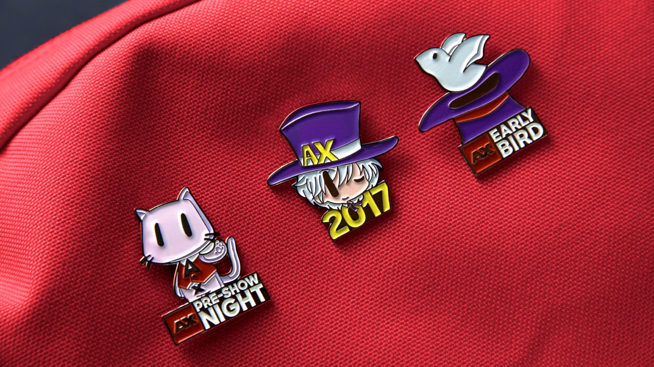
The collaboration yielded a 200% increase in sales of merchandise from the previous year and sold out 11 of the 15 SKUs.
Unconventional Wisdom Pays Off
Blind helped Anime Expo focus their brand and marketing strategy. This led to growth in ticket and merchandise sales, and brought in a new market of virtual attendees.
More importantly, Blind helped Anime Expo develop a truly powerful brand identity. The expo is currently the nation’s largest and most attended anime convention of the year, so building out a truly memorable experience that drives passion and sales was a major win for the Expo. With a new brand strategy, identity system, website, marketing campaign, and custom designed merchandise for the event, the expo had no issue standing out last year.
The partnership also benefitted Blind because they were able to gain a new client. The 2018 Anime Expo still demands a strong presence, and Blind will be spearheading this campaign to ensure that they remain on top.
For an agency, it's important to understand that Blind's success is correlative to the in depth research needed to understanding Anime Expo's brand. For a brand, Anime Expo's trust and flexibility complimented Blind's seamless integration strategies to place them on top. When brands shed the defensive barriers of their already existing marketing team to collaborate with an A+ agency, the results can be quite magical.
Be Like Water...With EXTREMELY Good Product Placement
Want another case study? We recently worked with Pilot Pen to build out an incredibly comprehensive brand integration campaign within Project Runway. We added in multiple elements including a prizing reel, behind the scenes content, and social media giveaways that made this partnership a wildly successful campaign for the brand.
We even created short, Oscar worthy videos that provide a breakdown of each component. Visit our Pilot Pen Project Runway Case Study page for the full case study goodness.
While you're at it, check out some of the blogs our team wrote on the subject:
And make sure you check out our e-book guide to Product Placement by clicking the image below! It provides insider advice on how you can best leverage content partnerships for your brand.